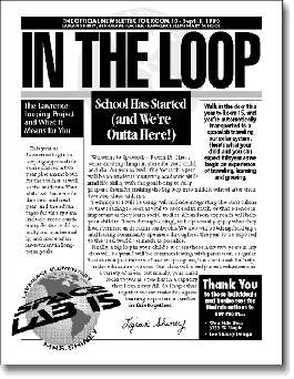
Several teachers have contacted us recently because the job of creating a newsletter has dropped into their laps. By keeping the process simple you won’t feel completely overwhelmed and your newsletter will more likely go out on a timely basis. Creating a work of art may sound nice, but the first priority is getting the news out.
Professional Guidelines
Start borrowing ideas from professionals, like font combinations. Look at a local newspaper and you’ll find Times for text and Helvetica Bold for heads may be pretty close to what they use – and these fonts are already on your computer. Magazines are also good starting points to view proportions of headline to text.
Go In Reverse
Use reverses (black or gray boxes with white text) sparingly for items to really stand out. You won’t need reverses for headlines (in our example here the “School Has Started” head would be better as big, bold, black Helvetica…this time the reverse is overused). Use them for contact info or smaller subheads for a more pleasing balance. Font tip: use a bold face for the white letters so they don’t seem so swallowed up by the surrounding black space.
Less is More
Especially if the newsletter is just for your class, try to keep it to one 8 1/2 by 11 (letter size) front and back, instead of adding more pages. It will be read more thoroughly and saved more often. Send out this format more frequently if necessary.
Chuck Your Page Layout Program
Just because you’ve got access to a fancy page layout program doesn’t mean you have the time to work through a steep learning curve. If your goal is simply to expedite getting the news out, do this:
1. “Dummy up” the layout on paper (while learning some newspaper terminology), drawing in margins, headlines and text. Use our example for a starting point if you like.
2. Measuring accurately, create each element separately in a word processor or simple graphics program. Use dummy text or rough, unedited text for this.
3. Print, then cut out each element and stick down to a sheet of paper with a glue stick.
4. Using this rough layout as a starting point, adjust sizes where needed to make things fit better. Also, try looking at it upside down to see if any issues of balance jump out.
5. Tape down your final layout onto a tabletop using heavier poster board, then use a T-square and triangle to keep things square and straight. Tip: use a very light blue pencil for drawing guides and making notes. They still make non-repro blue pencils just for this purpose, but test with your copier to make sure they won’t print out.
There is a Reason – Kern, Kern, Kern
Kerning is the process of adjusting letter spacing, and you should do it. Headlines will look better and body copy will be more readable. Try to tighten up individual letter pairs for headlines if possible, but at the very least, reduce the space between letters slightly overall. Compare printouts of normal and tighter-kerned text to see the subtle but greatly improved difference.
Proof Reed or Yule be in Serius Trouble
Sure, run the spell check, but remember the computer won’t know this from that. Have two people read through the final copy word for word for any errors, typographical as well as grammatical. 